

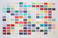
 The 10 'interlude' passages from The Waves (which are strategically placed throughout in the novel) have been combined in booklet form to allow for a concentration on these parts.
This process restores the continuity to what is essentially a sequential account of the passage of a day from beginning to end. To draw attention to the specific words relevant to this work, these are highlighted with a stripe of colour (as one commonly does with a fluorescent pen on a photocopied text one wants to return to). But, in this instance, the highlighting is not fluorescent but various (chosen from the 17 million colours on the computer). It is these colours that evolve into Palette 1:1 and constitute my personal chromatic interpretation of Woolf's words.
This palette, with its isolated blocks of colour, is a larger and more succinct version of the handbook - a chromatic distillation of her words. The latter are presented in a revised form, as titles or names to the colour swatches. To generate these names Woolf's words have been re-ordered and edited to make 'sense' as names - 'yellow excretions were exuded by slugs', for instance, becoming 'slug-excretion yellow'. These palettes, therefore, also constitute my attempt to construct a visual equivalent for her words to match up with the colours I have selected on her behalf.
 In recognising that Platte 1.1 represents a unique, selective, poetic reading of the natural world, it is also accurate to say that it is not all-encompassing (as one would expect, since Woolf never set out to describe all the colours there are to perceive). So to find a 'place' for these 'other' colours, Palette 2.1 evolved.
This palette reminds us that, since Woolf's time, many new synthetic colours have been created, turning 'apple leaf green' into a colour potentially much brighter than nature's version. And although similarly vivid colours may exist in nature (such as the bright green of chlorophyll revealed in new leaves backlit by late afternoon sun) the object's materiality and the colour's transience makes this colour less stable (leaves, being soft and cellular, absorb light and are less bright; also, the leaf will shrivel). Plastic, on the other hand, is quite a different material - smooth, shiny, reflective…causing a generally more vivid visual sensation.
These colours are sampled from objects in the photographs themselves, and are not Woolfian, but 'other'. In accordance with modern cataloguing techniques, each colour is given a unique alphanumeric code, which is essentially how the computer 'reads' it (and can digitally repeat it).
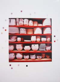
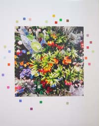 The still photograph provides a stasis in which the subject may be observed. Unlike the real world, it may be returned to, unchanged. Colour and nuance may also be observed. Having realised that to photograph a similar coastal/garden/interior environment to what Woolf describes would have resulted in a similarity or repetition of those colours described, I sought an alternative but comparable environment. The mega-store - where almost everything for the home, garden and outdoor leisure is sold - was the closest, singular, all-purpose realm I could find to parallel the natural one described by Woolf. There I looked for Woolf, via the recurrent motifs in The Waves: sea, sky, clouds, sand, rocks, rock-pools, flotsam, light and weather conditions…trees, leaves, plants, flowers, foliage, birds, insects, grass…curtains, a blind, furniture, plates, cutlery, a mirror…
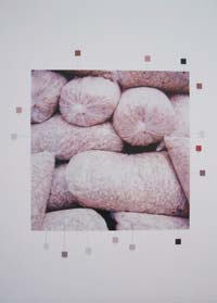 In this artificial environment, colour is in abundance and nature is a simulation of the real, packaged in manageable versions: grass by the metre, Christmas trees that don't drop their needles, and flowers that don't wilt. Daylight is imitated by bright overhead lighting, constant and slightly golden (like that of early morning or late afternoon). The soothing sound of ever-present waves that pervades the novel is supplanted by calming background music or the trickle of water from an indoor fountain. The movement of waves breaking on the shore is replaced by that of gliding trolley wheels propelling shoppers down aisles past multi choice merchandise, allowing the eye to scan for a shape of bowl, a size of shoe, or a colour of dress. These are the manufactured artifacts of our time, frozen in photographs for further scrutiny, which, with sufficient distance may be 'read' like the ancient pottery of Mesopotamia and Greece, as signifiers of the state of our aesthetic, technological (and other) advancement.
In these photographs colour is the primary visual objective, and object colours are sampled and isolated as a small swatch of colour (or as Woolf says, "blocks of matter" and "patches of light") outside the photographic frame. Labels are attached to these and a chain of interlocking premises results: a china bowl is 'bone white'; a net curtain, 'sand' and the packaging for a slug repellent is 'stalk green'…or, the terracotta colour of a plastic plant container is 'BO5A2A' and a stone is '868486'. Depending on whether the colours are 'Woolfian' (naturalistic - a reminder that colour names are largely derived from the natural world), a nuanced colour not named by Woolf, or synthetic, they are identified by either a name or an alphanumeric code...
In this work there appears neither white nor black, nor blue, nor red, nor yellow: the whole mass is, with little variation, of a sombre gray, the true resemblance of a dark and humid atmosphere, by which every object is rendered indistinct and almost colourless. This is both a faithful and a poetical concept of the subject; nature seems faint, half dissolved, and verging on annihilation, and the pathetic solemnity, grandeur, and simplicity of the effect, which can never be exceeded, is entirely derived from the painter's having departed from, and gone in direct opposition to, general practice.
John Opie
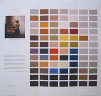 These are the words Professor John Opie described The Deluge by Nicolas Poussin, (a painting he had seen in Paris), to his students at the Royal Academy, London. There were no visual aids to his lecture - the nineteenth century had only just begun. Pre-photography, a painting could only be perceived either first-hand, as a hand-rendered copy, or as a print (most commonly a monochrome wood or steel engraving at that time); or, as a memory. Colour Codes was inspired by this emotionally descriptive account of the memory of a painting; a painting seen primarily in terms of its chromatic effect and through which, in its absence, the painting was brought evocatively into the presence of the minds of the audience.
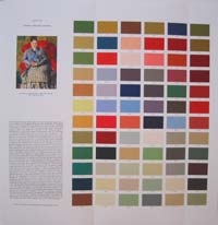 How Colour Codes relates to The Colours series is by way of a common interest in colour sensibility, the description of colour, and the creation of colour systems (a palette for each of the paintings is produced). Just as the palettes from Colour Codes are related to the two from The Colours, all potentially interlock with the larger network of other colour systems, past and present, collectively adding to a perception of colour. Where Colour Codes differs, however, is in its textual source, and its connections to art history, art theory, and (by extension) the art market.
In Colour Codes visual and linguistic colour sensibilities are paired and histories intertwined to achieve a material thickness of culture more complex as a whole than in part. In each of the main works, a colour reproduction of a painting is the relational centre of two other main components - a linguistic description of the painting, and a palette 'sampled' from the painting's colours - which collectively form part of the 'afterlife' of the painting. In my series, by positioning the painting (or more correctly its reproduction) in relation to two other things that have arisen out of it (the linguistic description and the palette of colours) I am revealing part of the iconosphere the painting floats within.
The description of a painting differs to Woolf's colour description as hers is based on direct observation of the natural world translated into words; the painting, however, is a 'translation' of that world into paint (with varying degrees if verisimilitude or departure) and its description is a linguistic interpretation of the painting. But because the painting is relatively static (as in unchanging, apart from external variables such as illumination and context - something that can be returned to with little or no change in a way a subject in the real world cannot), this allows the viewer to apprehend the image in a similar way to the writer (scale, reproduction variation, and viewing context aside), allowing for a closer involvement with the material. This aside, the texts themselves are quite varied, which allows access to different types of linguistically expressed colour description.
The palette, involving a digital sampling process to isolate the reproduced painting's colours, is a 'summary' of colours that were originally mixed pigments, but in my work ate in digitally synthesised form. As in The Colours, because the palette colours are identifies by an alphanumeric code, they may be accessed again.
The role of art reproduction becomes part of this discussion - the difference between the painting and its reproduction; between one reproduction and the next; as well as the role the reproduction plays in assisting the painting in entering the iconosphere. One work that extends the literal and reproductive translations of paintings is Whistler's Nocturne x Seven, with its seven reproduced versions of Whistler's .
 'You dream that there under this same sky…pleasant lands where the eye loses itself in distant perspectives, where the pupil dilates, where thoughts are transformed and purified, where the soul can be plunged into reverie as you look at the luminous atmosphere. You dream that you are there instead of here, you dream of dark forests, dappled plains, picturesque valleys posed like rests along your route, majestic mountains and frothing seas, the Alps, the Mediterranean, Italy, Spain, the Orient. Wait, open that album!'
Ernest Lacon
'And indeed, shapeless forms leave no memory except that of a possibility.'
Paul Valery
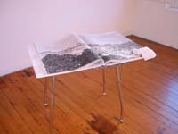
The Cloud of Unknowing - a series of images in book form - uses as a starting point two other books: The Cloud of Unknowing and The Universal Geography: The Earth and its Inhabitants. The title of my book and broad concept originates from The Cloud of Unknowing, a manual of medieval spirituality, and the imagery is drawn from The Universal Geography, a set of Victorian atlases.
What connects these sources is the universal aim: in the medieval book, thought to have been written by a monk or priest, the reader is encouraged to discover universal wisdom through contemplation. In the atlases, however, wisdom is considered to stem from universal knowledge.
My book The Cloud of Unknowing addresses the 'universal' with reference to current geographic trends and postcolonial thinking, accessed through late Victorian thought. To explore such concepts visually, landscape illustrations have been re-sequenced, not according to place (as in the original volumes) but as per patterns of prevailing weather. Rather than abrupt changes of sky from one illustration to the next, the transition is gradual, so skies above Arctic icefloes merge into desert sand. A strategy such as this places 'location' in a secondary role, thereby allowing the sky (usually overlooked) to become the primary signifier. The sequence-imposed, artificially generated sense of sameness results in a homogenisation of the visual material and is the antithesis of the variety that the atlases' originally sought to convey.